Educational Resources
I led a redesign of the Natural History Museum Website’s Educational Resources that increased user retention by 45%.
I led a redesign of the Natural History Museum Website’s Educational Resources that increased user retention by 45%.

Themes
Information Architecture,
Content Strategy
Team
Education Department, Creative Director, Associate Creative Director, Developer, and Myself
Tools
Sketch, InVision, Acuity Scheduling, Google Analytics
Timeline
1 Month
August 2020
INTRO
The Natural History Museums of Los Angeles County protect and share more than 35 million specimens and artifacts – the largest natural and cultural history collection in the western United States.
In 2019, I joined the museums as Senior Designer, responsible for leading human-centered design initiatives for our web properties, and advocating for design thinking within the organization.
The Education team needed a way to continue offering free school programs to teachers and students in the Los Angeles Unified School District (LAUSD). Our existing resources were tailored to onsite field trips, so we wanted to redesign the entire Educational Resources section of our website.

STUDENTS in LAUSD
With varying access to computers, Internet, childcare, and parental support.

TEACHERS in LAUSD
With very little guidance, and time to prepare for teaching online.
GOAL
USER INTERVIEWS
The Education team had an existing committee of LAUSD teachers, so I conducted 10 user interviews with teachers to understand COVID-19’s impact on teaching and learning. I also learned the jargon that teachers were familiar with: online classes were “distance learning”, and print materials were “learning packets”.
“We had to build the plane as we were flying it.”
–LAUSD teacher
KEY RESEARCH INSIGHTS

The Classroom Was an Equalizer
At home, not all students had Internet or computer access. Teachers lost contact with some students, so they mailed printed materials.

Online Resources Save the Day
Teachers were not used to teaching online, and relied on free, shareable content to engage students.

Foraging for Multimedia Content
Teachers spent an average of 4-5 hours / week (on laptops) searching (Google) for activity ideas, lesson plans, videos, and more.

Topic Over Grade Level
Teachers prioritized resources by topic, and looked above and below their grade level. They modified resources to suit their students’ learning level.
CONTENT AUDIT
In a few interviews, I heard that our existing Offsite Resources (a page with linked PDFs of lesson plans and activities) were hard to find, so I conducted a content audit of the entire Educational Resources section to identify opportunities for improvement.
I also used Google Analytics to set a baseline for current usage. Analytics showed that our Offsite Resources drove retention, but they were buried 3-levels down from the primary navigation:

Above: Our Offsite Resources page – PDFs of lesson plans and activities displayed as text links.
❌No Filter Functionality
We had approx. 50 resources, displayed as a long list of text links – users had no way to narrow down relevant resources.
❌Outdated Information
Being closed, we no longer offered onsite field trips and programs, yet our copy and sign up forms said otherwise.
❌Time-Consuming Navigation
Our resources were 3-levels down from the primary navigation, but Google Analytics revealed they drove retention.
❌Insufficient Context
Many of our resources did not indicate the topic or grade level, so teachers had to click on each one to find out.
DESIGN DIRECTION
Based on the variety of content and support teachers needed, I mapped out the tools and resources they used, to gauge where the museum best fit in their ecosystem.

Above: The ecosystem of resources and tools that teachers relied on. In green: best fit for the museum, based on our internal resources.
I realized that we could bring the most value by leading with multimedia resources and virtual programs. I compared a variety of experiences from other museums, online learning platforms, and educational content aggregators.

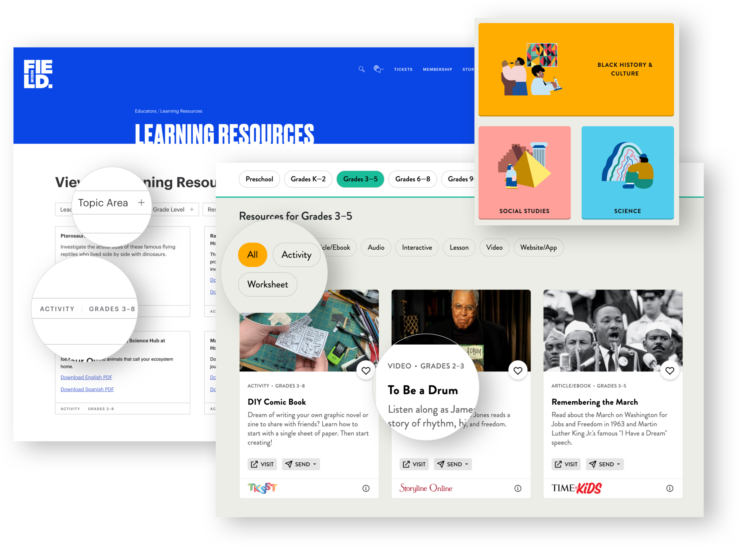
Above: the options that stood out had the ability to filter by topic, grade level, and resource type – this aligned with my findings from teacher interviews. Favorite (right): Wide Open School organized their resources by topic, and displayed them as tiles (with an image thumbnail, resource type, grade-level, title, and description).
DEFINING THE NEW EXPERIENCE
I kept these principles in mind while sketching ideas for our new Educational Resources. Our website already had great design patterns I could leverage for most of our components. This simplified development and maintained familiarity with users.
I concentrated my efforts on designing a new content type for learning resources, to support multimedia content, and provide the right context for teachers.
For online school programs, the Education team was already considering Acuity Scheduling (a 3rd party web tool for class scheduling), so I tested its capabilities, instead of designing our own scheduling tool, due to time constraints and the Education team only offering these programs until the museums reopened.
USABILITY TESTING
To make sure my design and content strategy worked as intended, I assembled a prototype and conducted 5 user testing sessions with teachers. Feedback was overwhelmingly positive, and most participants were able to find relevant resources quickly and easily:
“I really like how I can just have a quick look at everything … because the more I have to hunt, I may get a little discouraged. At this point, for us, time is kind of precious.”
– LAUSD teacher

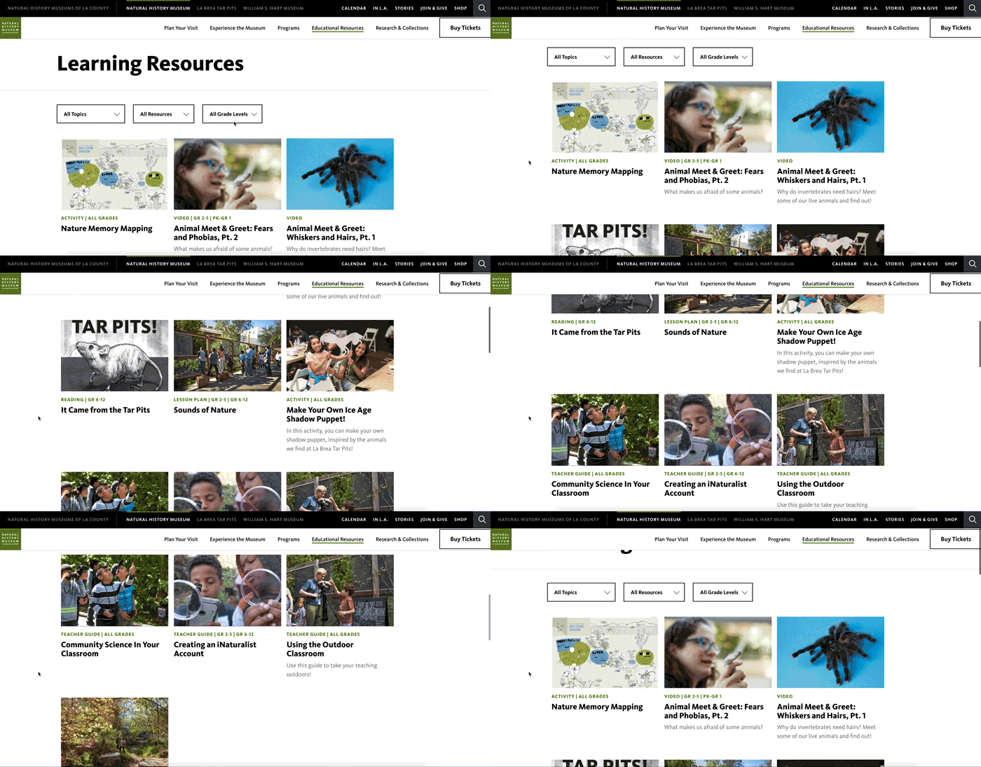
Above: Teacher scrolling through Learning Resources.
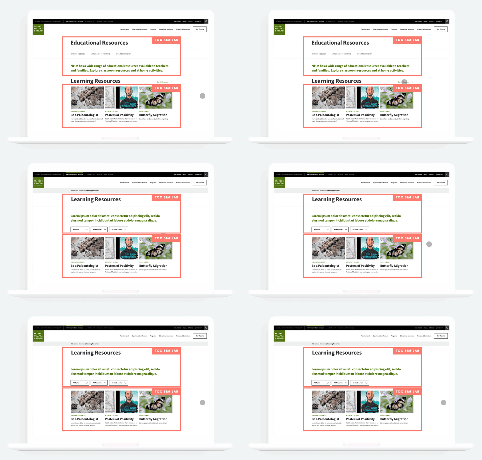
The participants who failed or took longer to complete their tasks, confused Educational Resources for Learning Resources. I concluded that we needed to visually differentiate these pages, and due to institutional constraints, changing the titles was not an option, so I explored another way.

BEFORE TESTING
Some teachers barely noticed they navigated to a different page, due to:
Similar page titles
Similar green intro text
Tiles above the fold were the same
AFTER TESTING
I achieved the visual difference we needed by:
Removing the green intro text on the Learning Resources page
Sorting content by “latest” on Learning Resources, and “featured” on Educational Resources

LAUNCH
My goal was to design a simple, valuable experience that would allow teachers and students to engage with the museum virtually. Below is a look at the final build.
Resources First
Buried resources were an issue in the past, and I addressed this by leading with resources on the top-level page, and including them in navigation.

Multimedia Content
Resources expanded from lesson plans, to videos, photo galleries, articles, activities, and teacher guides.

Filter Results
Teachers look for a variety of content, and tend to prioritize topic. I added filters to allow for narrowing down resources by topic, grade level (range), and resource type.

Download PDF
Our existing PDFs were recreated as responsive web pages. However, since teachers still mailed “learning packets” to students without Internet access, I included each document under a “Download PDF” button.

Scheduling
I embedded Acuity Scheduling to allow teachers to sign up for virtual school programs. These programs needed to allow one class per time slot, collect vital classroom information, and integrate seamlessly with our Zoom account. I collaborated closely with the Education team to make sure I captured all of their requirements.

RESULTS
Traffic Increase
Compared to our previous Education section
Retention Increase
Measured by users re-visiting the Education page
Conversion
Measured by users navigating to at least one resource or program
We've heard positive feedback from teachers since launching the new Education Resources section in September 2020. It feels rewarding to bring free, engaging content to teachers and students during a stressful, uncertain time.
The Education team felt empowered to create and publish learning resources on their own, and it fit seamlessly with our museum-wide content strategy.
I recommended partnering with Wide Open School, a resource aggregator that teachers raved about, to increase discovery and brand awareness.