Avenue
I created a design system from the ground up to set brand standards for a lean startup, and maximize design team efficiency as they scale.
I created a design system from the ground up to set brand standards for a lean startup, and maximize design team efficiency as they scale.

Themes
UI Design, Design System
Team
Vice President, UX Director, UX Designer, 2 Developers, and Myself
Tools
Sketch, InVision
Timeline
2 week sprint
May 2020
INTRO
Founded in 2020, Avenue is a new healthcare startup empowering care teams to digitally manage and monitor patients with chronic diseases. They believe the relationship between clinicians and patients helps drive positive outcomes.
Along with a brand identity, Avenue needed UI screens for a lead generating website. I wanted to design a system that not only included what they needed right now, but was built with efficiency and scalability in mind for future designers.
Challenge: Doing all of the above in 2 weeks.
GOAL
STAKEHOLDER INTERVIEWS
I took note of stakeholders’ goals and future product vision brought up in team meetings and one-on-one conversations:

I also noted the end users we were designing for:

CHRONIC DISEASE PATIENTS IN U.S.
Managing one or more chronic diseases, and receiving care from multiple providers.

TOTAL HEALTHCARE WORKERS IN U.S.*
*No data available for healthcare workers specifically in chronic care management.
COMPETITIVE ANALYSIS
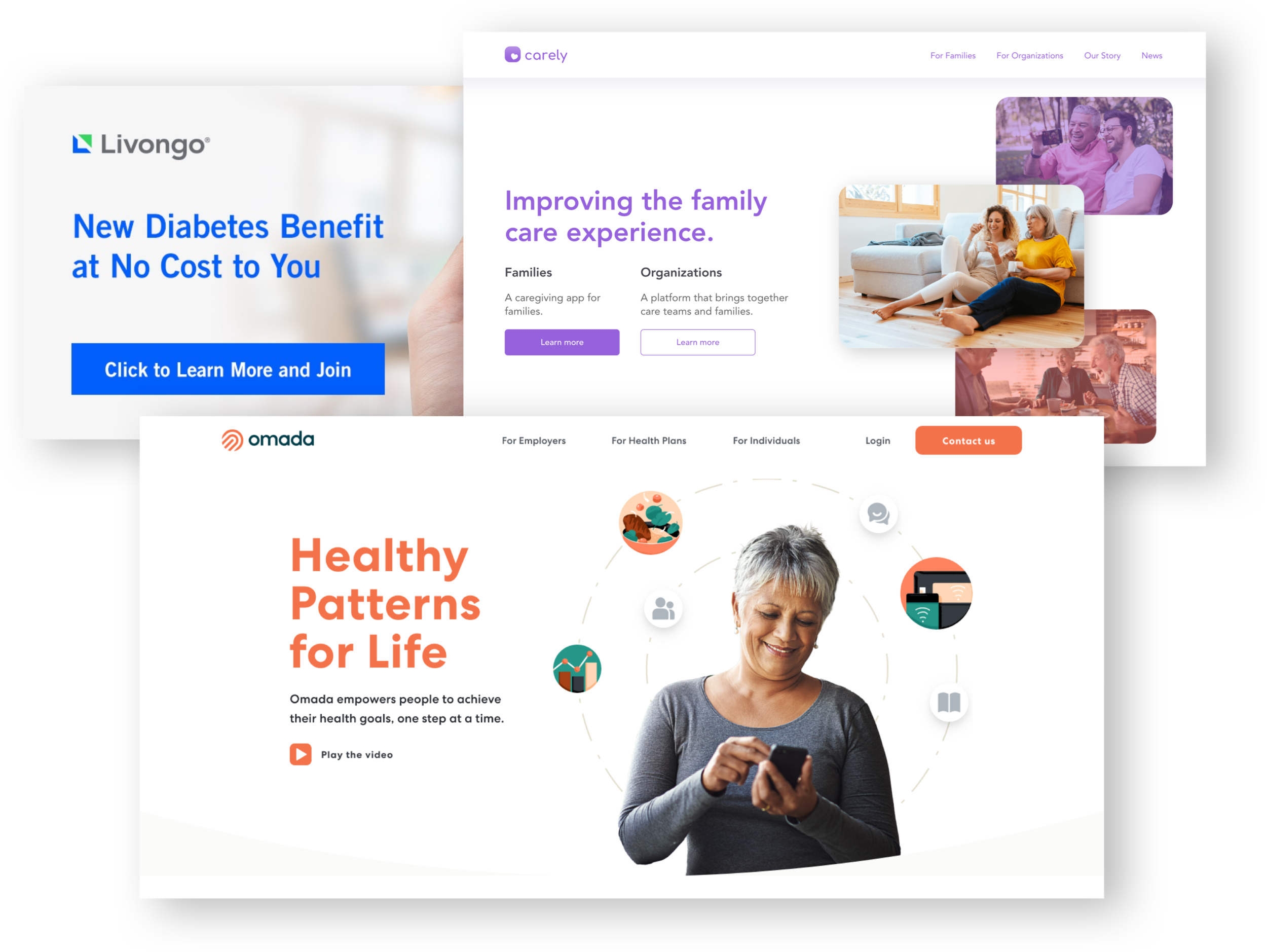
I took a look at competitors to make sure we created a system that stood out. I noticed an abundance of sans serif fonts, blue/green or blue/orange color palettes, and a mix of illustrations / photography:

DESIGN DIRECTION
Given the 2-week time constraint, I drew inspiration from Brad Frost's atomic design expansion, and chose the most fundamental building blocks to create a design system quickly. By defining styles, I could then build atoms, molecules, and ultimately, a system that’s organized and adaptable.

UI DESIGN
I relied on style tiles to test different color palettes and font families:

I tested color palettes with multiple skin tones, to reflect the diversity of healthcare workers, and ensure a flattering look across Avenue’s photography:

Avenue needed to work as a data-driven platform, and ensure readability of data. I knew clinicians would most often use Avenue during the day in a medical office environment, but due to project constraints, I was unable to gather patient use and environment data.
Solution: I opted for a light theme to match daytime use, with a soft color palette that was easier on the eyes, and looked flattering for most skin tones. I also included data visualization options for future use.

I also wanted to make sure the font family worked across web and mobile devices, regardless of operating system and connection speed, while helping Avenue stand out from competitors.
Solution: I chose 2 font families from Google Fonts, as their servers automatically send the smallest possible file to every user based on the technologies that their device supports.

Inspired by the brand identity, I wanted UI elements to visually reinforce the core mission to bring humanity to healthcare technology.
Solution: I rounded corners to soften shapes for form fields, buttons, and image frames. This created a sense of ease and friendliness throughout the system.

As I continued designing pages for the lead generation website, I organized components as nested symbols to be used as a Sketch library for future projects. This way, every team member and future designer would access the most current designs, saving time for the important work.

The Avenue design system ensured the lean startup had a great-looking initial launch that stood out from competitors. It was built to maximize team efficiency and scale to include a future web and mobile app.
If I were to revisit this project with what I now know about accessibility, I would refine the primary color palette to meet contrast ratio guidelines—ensuring a more inclusive experience while still honoring the essence of the Avenue brand.